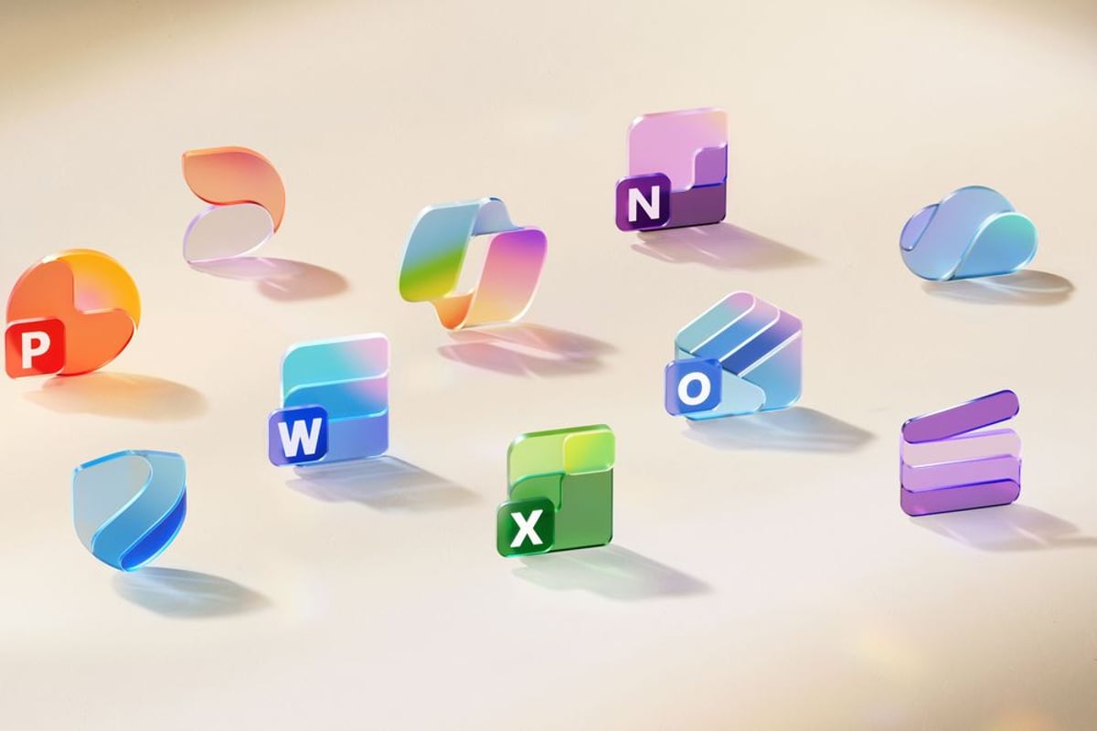
Microsoft just unveiled its most significant Office icon redesign in seven years, swapping the angular aesthetic that defined the productivity suite since 2018 for softer, gradient-rich curves inspired by its AI Copilot branding. The refresh affects all 10 core Microsoft 365 apps and signals the company's broader design pivot toward what executives call "fluid forms" - a visual language meant to reflect how AI is reshaping workplace software.
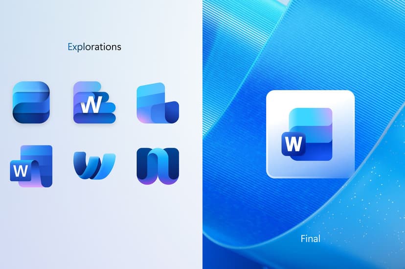
Microsoft is making its biggest visual statement about the future of work in years. The company's new Office icons, officially unveiled today, represent more than just a design refresh - they're a signal that AI has fundamentally changed how Microsoft thinks about productivity software. The Copilot-inspired redesign affects every core app millions use daily, from Word and Excel to Teams and PowerPoint. This marks the first major icon overhaul since 2018, when Microsoft last tried to modernize its productivity suite's visual identity. But where that previous refresh emphasized clean geometric shapes and bold colors, the new approach embraces what Jon Friedman, Microsoft's corporate vice president of design and research, calls "fluid forms." "We've moved away from bold, static solidity to embrace softer, more fluid forms," Friedman explained in Microsoft's design blog. "Sharp edges and crisp lines are replaced by smooth folds and curves, giving the icons a sense of playful motion and approachability." The timing isn't coincidental. Microsoft's design team drew direct inspiration from the Copilot icon, which has become the visual face of the company's AI-first strategy. The result is a more cohesive design system that reflects what Friedman describes as "connection, coherence, seamless collaboration, fluid transitions" - language that mirrors how Microsoft positions its AI-powered productivity tools. The changes go beyond aesthetics. Microsoft simplified several icons for practical reasons, with the Word icon losing one of its four horizontal bars to improve readability on smaller screens. Similar refinements across the suite reflect how users increasingly access Office apps on mobile devices and in crowded browser tabs. Color gets a major upgrade too. "Where gradients were once subtle, they're now richer and more vibrant, featuring exaggerated analogous transitions that improve contrast and accessibility," Friedman noted. The approach echoes Google's recent logo refresh, suggesting both tech giants see gradients as the visual language of the AI era. For enterprise customers, the redesign represents Microsoft's attempt to make productivity software feel less corporate and more approachable. The "playful motion" Friedman references could help Microsoft compete with newer workplace tools like Notion and Slack, which have gained traction partly through more modern, friendly interfaces. The rollout strategy reflects Microsoft's hybrid workplace reality. Icons will appear across web, desktop, and mobile versions of Microsoft 365 over the coming weeks, ensuring visual consistency whether users access Office through browsers, installed apps, or smartphones. Both consumer and commercial customers will see the changes simultaneously. Industry observers note the redesign's broader implications. By aligning Office icons with Copilot's visual identity, Microsoft is essentially rebranding its entire productivity suite around AI capabilities. It's a visual bet that artificial intelligence will define the next generation of workplace software - and that Microsoft wants to be seen as leading that transformation. The move also highlights how design has become a competitive battlefield in enterprise software. As companies like Google and emerging startups challenge Microsoft's productivity dominance, visual identity becomes a way to signal innovation and modernity to decision-makers evaluating workplace tools.
Microsoft's icon redesign isn't just about aesthetics - it's a strategic repositioning around AI that affects millions of daily users. By aligning Office's visual identity with Copilot, the company is betting that productivity software's future lies in artificial intelligence integration. The rollout over the coming weeks will test whether users embrace the more playful, curved approach or miss the geometric precision that defined Office for nearly a decade. Either way, it signals Microsoft's confidence that AI-first design principles will define the next era of workplace software.