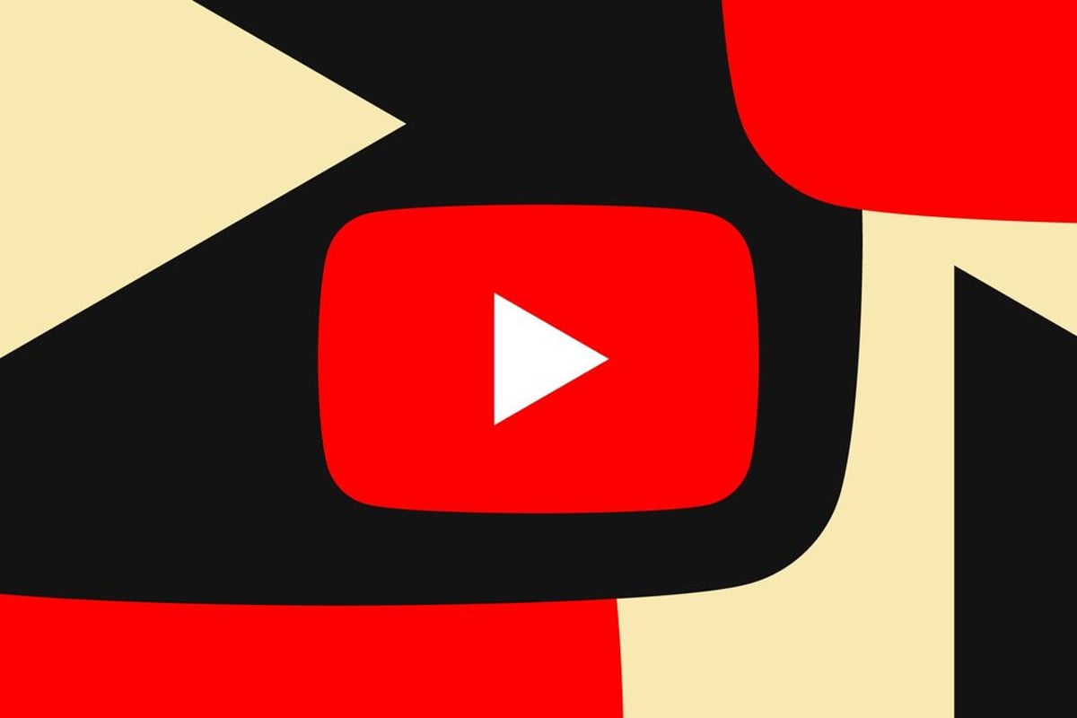
YouTube is rolling out a redesigned video player interface this week, introducing what the company calls a "cleaner and more immersive" viewing experience. The update brings rounded on-screen buttons with subtle translucency effects to mobile, web, and TV devices, marking the platform's first major player redesign since testing began earlier this year.
YouTube just gave its 2.7 billion users something they didn't know they wanted - a video player that actually gets out of the way. The platform's new "cleaner and more immersive" interface started rolling out this week, bringing rounded buttons and subtle translucency effects that feel surprisingly fresh for a platform that's looked largely the same for years.
The redesign centers on what YouTube describes as "updated controls and new icons to make the viewing experience more visually satisfying while obscuring less content." Translation: they're finally admitting those chunky old buttons were blocking too much of your video. The new interface features rounded on-screen controls with just enough transparency to feel modern without going full Apple Liquid Glass - a smart move that avoids the "too much translucency" trap that's caught other platforms.
This isn't Google's first rodeo with YouTube interface changes. The company has been testing these updates since earlier this year, gradually rolling them out to small user groups before committing to the full deployment. That methodical approach shows in the polish - these aren't the jarring overnight changes that usually send users into revolt mode.
But the visual refresh is just the opening act. YouTube's also overhauling some core interaction patterns that millions use daily. The double-tap to skip feature - you know, that thing you probably do without thinking when someone's taking too long to get to the point - is getting what the company calls a "modern and less intrusive" makeover. No more clunky animations that feel like they're from 2015.
The comment system is getting some love too, with what YouTube calls a "structured system for comment replies" designed to create a "more focused reading experience within the replies panel." Anyone who's tried to follow a heated discussion in YouTube comments knows this is desperately needed - the current system feels like trying to read a conversation through a kaleidoscope.
Perhaps the most delightfully unnecessary addition is dynamic like button animations. Hit the thumbs up on a music video, and you'll see a musical note animation. It's the kind of small touch that doesn't move any needles but makes the platform feel more alive. These contextual animations suggest YouTube's thinking beyond just functional improvements toward creating moments of delight - something the platform has frankly been lacking.
The timing isn't accidental. With TikTok and Instagram constantly refining their video experiences, YouTube can't afford to feel dated. The platform processes over 720,000 hours of video uploads daily, but if the interface feels clunky compared to newer competitors, those creator hours don't matter much.
The rollout spans mobile, web, and TV devices simultaneously - a logistical feat that shows Google has learned from past botched launches. Remember when YouTube's last major redesign in 2017 left TV users with a completely different experience? This coordinated approach suggests they're taking user experience consistency seriously.
What's particularly smart about this update is what it doesn't change. The core functionality remains identical - no relocated buttons or mysterious new features that require tutorials. It's a design evolution, not a revolution, which means users get the benefits without the learning curve that typically accompanies major platform updates.
YouTube's interface refresh represents the kind of thoughtful evolution that major platforms need but rarely execute well. By focusing on subtle improvements rather than dramatic overhauls, Google has created an update that enhances the viewing experience without disrupting established user behaviors. The coordinated rollout across all platforms and the attention to contextual details like dynamic animations suggest YouTube is finally treating its interface with the same care it applies to its recommendation algorithms. For the platform's billions of daily users, that translates to a cleaner, more enjoyable way to consume the endless stream of content that defines modern digital life.


![[Infographic] Samsung AI Appliances Deliver Inclusive Experiences Through Enhanced Accessibility Features](/cdn-cgi/image/width=828,quality=75,format=auto,fit=cover/https://charming-card-d91ad3487b.media.strapiapp.com/file_e6b7515270.png)